Creating Stunning Minimalist Web Designs
8 November 2024In today’s digital world, minimalist web design is key to making websites easy to use. It focuses on clean design to make sites elegant and functional. This style uses simplicity and clarity to highlight the beauty of a website without clutter.
It’s all about finding the right mix of looks and usability. This knowledge is crucial for making your online space stand out. We’ll explore how minimalist design can improve your website.
Understanding Minimalism in Web Design
Minimalist design is all about simplicity and function. It comes from art and architecture, removing what’s not needed. In web design, it makes things clear and engaging. Tech sites use it to offer a simple yet effective online experience.
What is Minimalist Design?
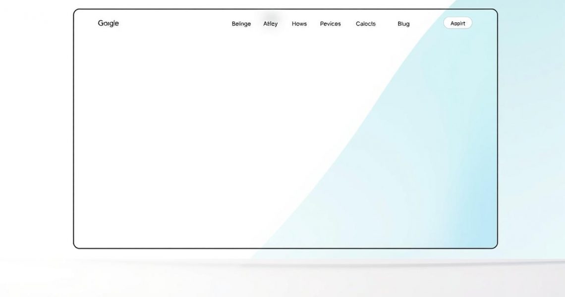
Minimalist design is a visual style that values simplicity. It removes clutter and focuses on what’s important. Websites with this design use lots of space, clean lines, and easy navigation. This makes them efficient and easy to use.

Benefits of Minimalist Web Design
Minimalist design has many benefits for both users and creators. Here are some key advantages:
- Improved load times, keeping users engaged.
- Enhanced usability, with easier navigation.
- Better mobile responsiveness, for smartphone users.
Studies show minimalism affects user behavior positively. It reduces cognitive load, helping users focus. This leads to better engagement, higher conversion rates, and user satisfaction. Users prefer clean, minimalist designs, making it a smart choice for web developers.
| Feature | Traditional Design | Minimalist Design |
|---|---|---|
| Load Time | Slower due to heavy elements | Faster with streamlined components |
| User Engagement | Often lower with cluttered interfaces | Higher due to clear focus on content |
| Usability | Potentially complicated navigation | Simple, user-friendly interfaces |
Creating Stunning Minimalist Web Designs
Minimalist web design is all about simplicity and clarity. It’s about making things easy to understand and use. The right colors can make it even better. Let’s see how these elements come together.
Key Principles of Minimalism
Good minimalist web design is simple and clear. Here are some key points:
- Visual Hierarchy: A clear order helps users move through content easily.
- Simplicity: Fewer elements mean less to distract from important content.
- Functionality in Design: Each part should help the user, making their experience better.
Websites like Apple and Google show how well these principles work. They use clean designs and easy layouts. This makes users happy and engaged.
Choosing the Right Color Palette
Choosing the right colors is crucial in minimalist design. Color theory helps us understand how colors affect us. Here are some tips:
- Emotional Impact of Colors: Colors can make us feel certain ways, like blue for trust or yellow for happiness.
- Minimalist Color Schemes: Using fewer colors makes the design look better and more unified.
- Brand Consistency: Using the same colors everywhere helps people recognize your brand.

Airbnb shows how colors can make a minimalist design pop. They use soft colors that feel good to users and keep the design clean. The right colors can turn a simple site into something amazing.
Essential Elements of Minimalist Web Design
Minimalist web design focuses on key elements like whitespace, typography, and imagery. Each plays a big role in making sites clean and easy to use. They help keep the focus and keep users engaged.
Whitespace: The Importance of Space
Whitespace, or negative space, is crucial in minimalist design. It gives your layout room to breathe, making content easier to read. It also helps with site navigation.
By using whitespace wisely, designers can make sites feel bigger and more welcoming. This lets important parts stand out while giving them space to breathe.
Typography in Minimalist Design
Choosing the right fonts is key in minimalist design. The right font sizes, line spacing, and hierarchy are vital for clear communication. This makes the site easy to read and understand.
Designers use different fonts to keep things interesting without losing simplicity. Apple shows how clear, simple text can engage users.
Imagery: Quality Over Quantity
For imagery, it’s better to have a few high-quality images than many low-quality ones. These images should match your brand’s message. They should tell a story without cluttering the site.
Airbnb is great at using images that tell a story. They do this without taking away from the site’s minimalist look.

